Case study ·
CS-05
·
Recurly
Untangling credits: task success up 21 points across Recurly’s key billing tasks
I updated and tested a complex system of charges and invoices to add credit functionality, touching everything from the UI to emails and PDF invoices. My first project at Recurly.
01
Hundreds of billing actions a day, every one of them tedious
Recurly is a B2B2C subscription management platform: businesses run their plans, payments, invoices, and customer communications through it. So every billing design lands twice, once on the merchant’s team and once in their customers’ inboxes. Before this project, credits were added as line items on invoices, which confused both audiences, and standalone credit documents sat near the top of the feature-request pile.
I interviewed 6 merchants about their credit practices, and the tedium was the story. Customer service reps handle charges, credits, and refunds hundreds of times per day. After invoicing one, users added an account note 83% of the time, several extra steps every single time. And the refund page had a confusing interface with no way to preview the refund invoice, so what customers received was a surprise, and surprises became support tickets.
Field note
When someone repeats a flow hundreds of times a day, every extra step is a tax. The 83% account-note habit was users invoicing us for it.


02
The reframe: a credit memo is a negative invoice
The old model bolted credits onto whatever invoice came along next: new invoices picked up all orphan credits and charges, without a clear explanation, and emailed the customer. Instead of patching that, I reframed the document space itself. A credit memo is just a negative invoice. That one idea gave us a system of three distinct document types (charge, credit, and refund invoices) sharing one consistent design, and it matches how accountants already keep books, since credit memos are standard accounting practice.
To prove the model could stretch, I mapped the information hierarchy for invoices and customer emails across the whole system: over 45 use cases across 13 emails. One constraint shaped all of it. Technical limitations meant the email and invoice redesign had to minimize structural changes, so clarity had to come from hierarchy and language, not from rebuilding the templates.
Why it held
Good system models are borrowed, not invented. Accounting solved this document problem a few centuries before SaaS did.

03
Three calls: one document system, one combined flow, three phases
The project’s shape came down to three decisions.
Honest ledger
The costs column is real. Two of these three calls made my own job harder before they made anyone’s job easier.


04
Shipped: three document types, and emails that answer two questions
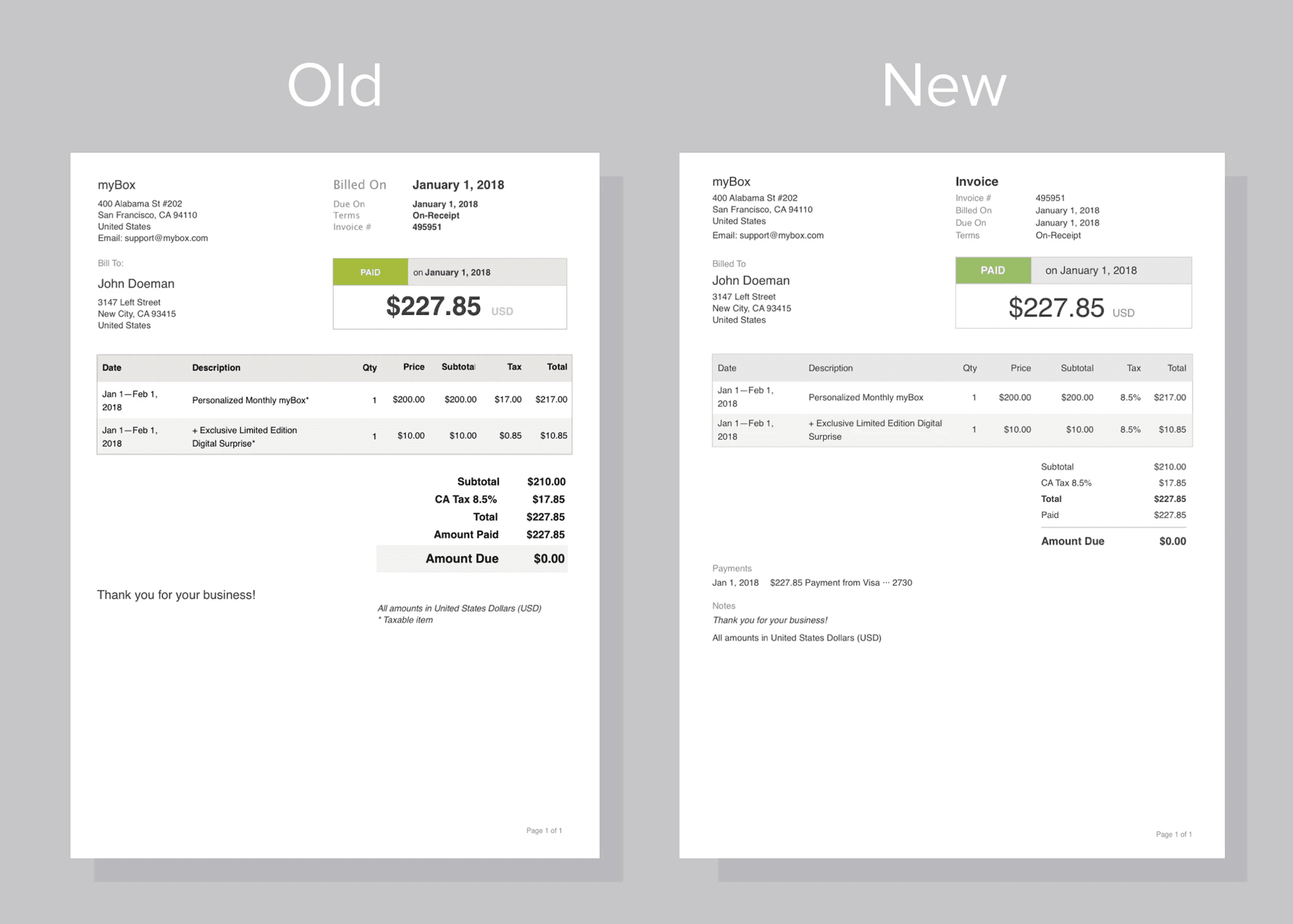
The customer email was refocused on the two questions every recipient actually has: “Why am I receiving this?” and “How much was I charged?” Invoices got the same treatment (fig. 1): the document type stands out at the top, the subtotal section reads cleanly, and a new transaction history gives a record of payments and credit usage on the document itself. The refund flow was rebuilt around clearly presented choices, quantity or a specific amount, with prorating support, an account note, and the much-requested ability to preview and edit the refund before it reaches a customer.
Merchant · testing
“The refund invoice tells me the story perfectly.”


05
Task success up 21 points, with the benchmark receipts to show for it
The per-task efficiency jumps (cancel subscription 49→100, add subscription 29→91, issue refund 20→87) are runs 1–2 of the usability benchmark I ran at Recurly, shown for context.
“YAY! You can do credit memos! We previously had to use Quickbooks.” — Merchant, usability testing
“The note makes crediting 180 people for an out of stock item a lot easier!” — Merchant, usability testing
Testing validated the system: the separation of invoice types made sense to the people who live in it. And the first quote is my favorite kind of impact, a merchant retiring their workaround in a different product because ours finally did the job.
06
What changed beyond the interface
This was a significant early success at Recurly, and it set the research and testing practice I used there from then on. The project taught me, early in my time at a new company, how much a close working relationship with a PM and a steady testing cadence compound: involve users throughout, and design’s impact on the business stops being an assertion. That became my default at Recurly.
Team practice, established early
The workflow’s first real usability testing — and it stuck. A steady testing cadence became my default at Recurly, and usability testing became a team habit that outlived the project.
07
Power users tell you the truth fastest
Testing the riskiest phase with the 8 top credit creators, the people who felt every extra step hundreds of times a day, meant the feedback was immediate, specific, and impossible to argue with. One page can’t hold all of it.
Closing note
The best compliment this system got was silence: three document types, and nobody had to ask which was which.